CALL FOR ARTISTS
Our brewery invites applications from artists and illustrators, with priority given to those residing in Calgary or Alberta, for artwork to include in beer labels for our limited edition barrel-aged bottle program. This is an ongoing, open call. We welcome applications at any time.
FEATURED ARTISTS
SARAH SLAUGHTER
Sarah Slaughter is a Calgary-based visual artist whose practice is a reflection of her wide-open perspective and respect for multi-disciplinary creation. Immersed in a world where art is everything, she distinguishes herself by her versatility and fearless approach to design and ingenuity


SHALOM TOY
Shalom Toy (who creates visual work as Cosmic Cavern Studio) is a musician and multidisciplinary designer from Calgary, AB whose work depicts an array of visual sensibilities and translates a consistent degree of feeling with each formed discipline. Her use of colour is a unifying quality across her work depicting a sense of lightheartedness or nostalgia even while portraying less than optimistic underlying subjects.
“One theme that I wanted to incorporate in the “Ruby, My Dear” label design was Thelonious’ ability to turn space over to his collaborators, which allowed them to shine in the pieces they would perform together. He didn’t perceive his peers talents or musicianship as a threat but something that could be spotlighted and encouraged. I wanted to explore an underlying concept of growth that can happen when you give and are given a combination of encouragement, creative agency and a sense of community with those around you. The piano RV/tiny home look of the illustration felt like a fun quirky play on that idea.”


ADRIENNE TOLLAS
Adrienne is an illustrator, character designer, painter, and comic artist. Her work is inspired by the imperfection that comes with being human, the natural world, informal fantasy, and everyday people. When she's not drawing, you can find her travelling by bicycle on Treaty 7 Territory, practicing active transportation and year-round climate sustainability (sometimes with her cat friend).
“Many things in life can create Innocuous Thrill. Doodling, helping someone grow, riding a bike, having your gender affirmed. In a society capable of harm, there are those who bloom despite all odds, and share their sunlight and water with everyone. This illustration is shown literally blooming, the person's head held high, invoking a feeling of hope and pride.”
“Inspired by the Arctic Monkeys track, a witch serenely drifts past, framed by the "moon", en route to enjoy her brew with some pals. Like Innocuous Thrill, the Potion Approaching illustration was made with pencil and pen, scanned, and digitally cleaned up to preserve that "drawn right on the bottle" charm.”


Mackenzie Bedford
Mackenzie Bedford is a telescope for queer space. The universe, by nature, is mysterious and queer. Exhausted by perspectives that lack the imagination and diversity it demands, she is revealing the queerness of the cosmos through visual narrative.
“What better name for a space-racehorse than Cherry-coloured Funk? This label celebrates the funky, the tart and the adrenaline rush of rooting for a ridiculous name.”
“Feedback in the Field is an homage to the unexpected. It is inspired by bird watchers who will spend hours, days, even years, waiting for that one moment where nature reveals its true self.”


MARY HAASDYK
Mary Haasdyk is a Calgary-based illustrator working in editorial, publishing and public art. She brings a fresh perspective with her emotive and playful illustrations and enjoys the challenge of finding unexpected visual solutions. Her work has been recognized by Spectrum Fantastic Arts, American Illustration, Society of Illustrators West and Applied Arts.
On Erlton Street (2021), Mary says: “As an homage to the original location of The Establishment Brewing Company and the notorious flood of 2013, the Erlton Street house is shown submerged inside a fishbowl - picturing it as a preserved or drowned curiosity, attracting the attention even of the fish, who are looking in from the outside.”
Mary said this about Sunblind: “As an ode to long summer days and sunshine, I was thinking about the blissful feeling of a sun nap and its ability to make you forget the world. This illustration features one such sunbather passed out with his face shaded behind a book. Peaches are around him and featured on the cover of his book; his sunglasses cast aside.”


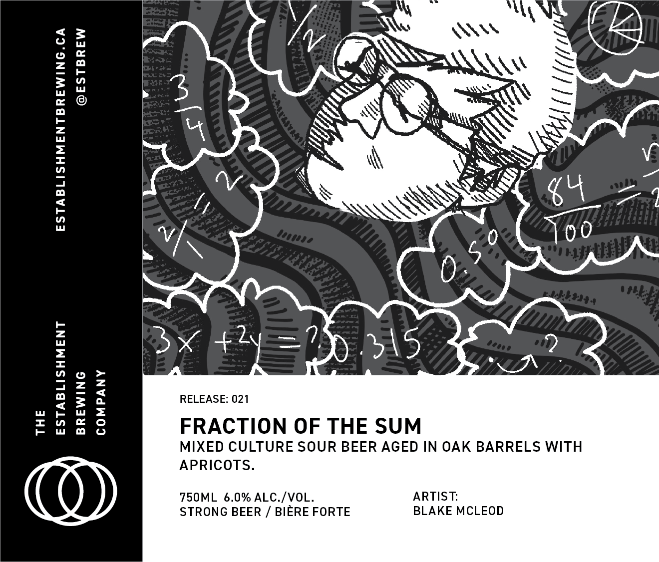
BLAKE MCLEOD
Blake McLeod (they/them) is a Cree nonbinary queer artist living and working in Mohkinstsis, Treaty 7 Territory. With the means of illustration, graphic design, photo, video, and radio, they strive to build an intimate community for folks to feel free and safe to be who they are.
“A piece, a sliver, a fraction. We are all pieces to make something bigger together. Community, love, coming together. In my illustration for Fraction of the Sum, I contemplate what it means for the self to be part of something bigger - with just a dash of math along the way. We are all just a fraction of the sum.“
On Beauty In The Vibrant Form, Blake says: “Navigating the appreciation for what it is that builds the form, I was drawn to circular imagery to resemble molecular structure. The use of organic B.C. nectarines is brought to attention with the label’s prominent illustration.”


Ryan McCourt
No, Ryan McCourt isn't a professional dancer; but you're not the first to ask. He's an award-winning, shit-disturbing, modernist artist from Edmonton. There, in that wayward frontier city, he founded the North Edmonton Sculpture Workshop, a co-operative shared studio, and Common Sense, an independent artist-run gallery.
"This ambiguous artwork is inspired by the "Root Down" name, the "interplay between the complex mixed cultures," and the dualities ('old world' traditions/‘new world' thinking, art/science, yin/yang, etc.) inherent to beer-making... and life. Right-side up, you'll see a ginger-bearded wise man, clothed in a starry robe. To the right, a small chapel, and beyond… an inverted landscape in the sky? Upside-down, you'll see "Device to Root Out Evil" by Dennis Oppenheim, a well-known Calgary public artwork. Oppenheim's sculpture—a tiny church with its steeple jabbed into the ground to "ROOT DOWN" and vaccinate against earthly evil—also plays with contrasting dualities and inversions. A masked, modern woman appears in the foreground of the inverted image: smartly dressed, ginger curls up in a sophisticated do. Above her, an open, starry sky."
"Ramblin' Rose is an old torch song, sung from the perspective of a tragically besotted suitor, about a 'wild and wind-blown' wanderer who goes their way. It brought to my mind the classical Greek myth of Hades and Persephone (mother of Dionysus), which inspired this ambiguous image. Persephone, the goddess of grain, was gathering flowers in a field when Hades, god of the dead, plucked her up and took her down to his Underworld kingdom. There, confined in darkness as his queen, she was obliged to spend part of the year; however, she could still roam freely above ground for the rest of the year. Not even dread Hades "can cling to a ramblin' rose." This story is parallel to the beer itself: chosen grains and roses, married with the magical powers of decomposition, mingling in the mysterious sanctum of the oaken barrel, create a legendary union."


Photo by Michaela Neuman
Mike Hooves
Mike Hooves is a multi-disciplinary prairie artist working in illustration, animation, and film in Calgary, Alberta. Mike playfully acknowledges queer culture using shape, color, and gesture while showcasing emotionally relatable scenes and imagery.
On Little Wing, Mike says: "Playful young sphinxes seek their encouraging mother's attention as they fly, the scene framed by large plums."
Mike said this about Blackbird, "The avian namesake of the beer and influence from Greek mythology-inspired an image of friendly blackbird harpies feasting on berries. The original ink drawing was scanned and digitally cleaned up into the image you see here."


Cassie Suche
Cassie Suche is a contemporary abstract artist working in Calgary, AB. Her work is distinguishable for its delicate balance of structure and spontaneity, expressed through a visual language of linear and modular forms. Suche takes a highly experimental approach to generate work, focusing heavily on material research and process.
“In designing these labels, I used the names of the special release barrel-aged beers to spark inspiration. Astronomie Domine made me think of the celestial bodies and their interactions with one another, while Resonant Frequencies gave me visions of rippling channels of energy. Both evoke the idea of combining science and mysticism. They hint at the invisible and mysterious forces that exist around us and influence us in strange ways.”


2022 3-year anniversary limited-edition merchandise designed by Cassie Suche.

Eric Dyck
Eric Dyck is a cartoonist and art educator living and working in Lethbridge, Alberta. His work explores the history, people, and critters in Southern Alberta. Eric writes and draws the non-fiction comic strip Slaughterhouse Slough, and his illustrations can also be found at The Sprawl, Wider Horizons, and the Galt Museum.
"The Born To Run label celebrates Calgary's former transient celebrity, Turk Diggler, the wild turkey (Meleagris gallopavo) skulking about in the Ramsay neighborhood since the spring of 2019. Turk was a reminder of Calgary's relentless sprawl into the habitats and ecosystems of Alberta and the stubborn determination of the prairie's fauna to adapt to urban settings. In April of 2020, Turk said, "I gotta find out how it feels," and he hit the road, leaving the neighbourhood of Ramsay behind, looking for love."
On Erlton Street (2020): "My wife, Teri, and I began our drive across the country, to move back to Alberta, at the end of June 2013. We began to hear the reports of the devastation in Calgary and surrounding communities on the 21st, and it became clear that we were on our way to a province in distress. "Little did we know that those same floodwaters were surrounding and confounding some would-be entrepreneurs, who shared equal parts perseverance and fool-hardy stubbornness. Those traits have certainly come in handy, seven years later, as The Establishment crew tries to navigate the swirling waist-deep sludge that is 2020. So we raise our glasses to you, good sirs."


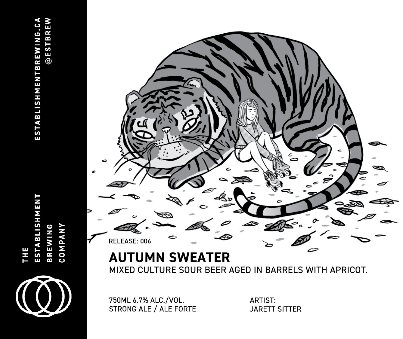
JARETT SITTER
Absurding the norm and introducing the weird into an environment, whether in illustration or live-action animation, Jarett's work brings strange life to image. Creepy, playful, with elements of softness and manic absurdity, illustrations act as a window into a world with no explanation in which the characters inhabit.
"When coming up with the idea for Autumn Sweater, I knew I'd have to think in black and white where I would typically employ fall colors, so I came up with the idea of a tiger-like cat that still gave me the feeling of "orange" without actually coloring anything. Having a big, protective cat to lean against created a sense of warmth and comfort that the name evoked in me while still keeping an element of danger mixed with the bizarre, and a little bit of cute, that is inherent in a lot of my work."
“For Erlton Street (2019), a tribute to the original Establishment hit by the 2013 flood, he depicts a man fishing, trying to make the best out of a bad situation, while playing with scale in a sort of fantastical way.”
"Here I am referencing trumpet playing jazz musician Louis Prima who released the album The Wildest! in 1956 and was the inspiration for this beer's title. The image plays with the idea of 'the wild' by having a wild creature within nature, displaying the wildness of its erratic/untamed behaviour, in addition to being 'wild' as in absurd or ludicrous; being part animal and instrument."
On Ruby, My Dear, he says, "As someone who was named after a jazz musician (Keith Jarrett), I was excited to see how I might explore this beer's namesake. The piano, of course, references Thelonious Monk. The cats serve the purpose of a subtle nod to the jazz slang of Monk's time when a jazz musician would be called a 'cat.' It also hits a more personal note as growing up, my family had a stray cat for a time that my mom had named 'Thelonious' (apparently she was prone to naming things after jazz musicians)."


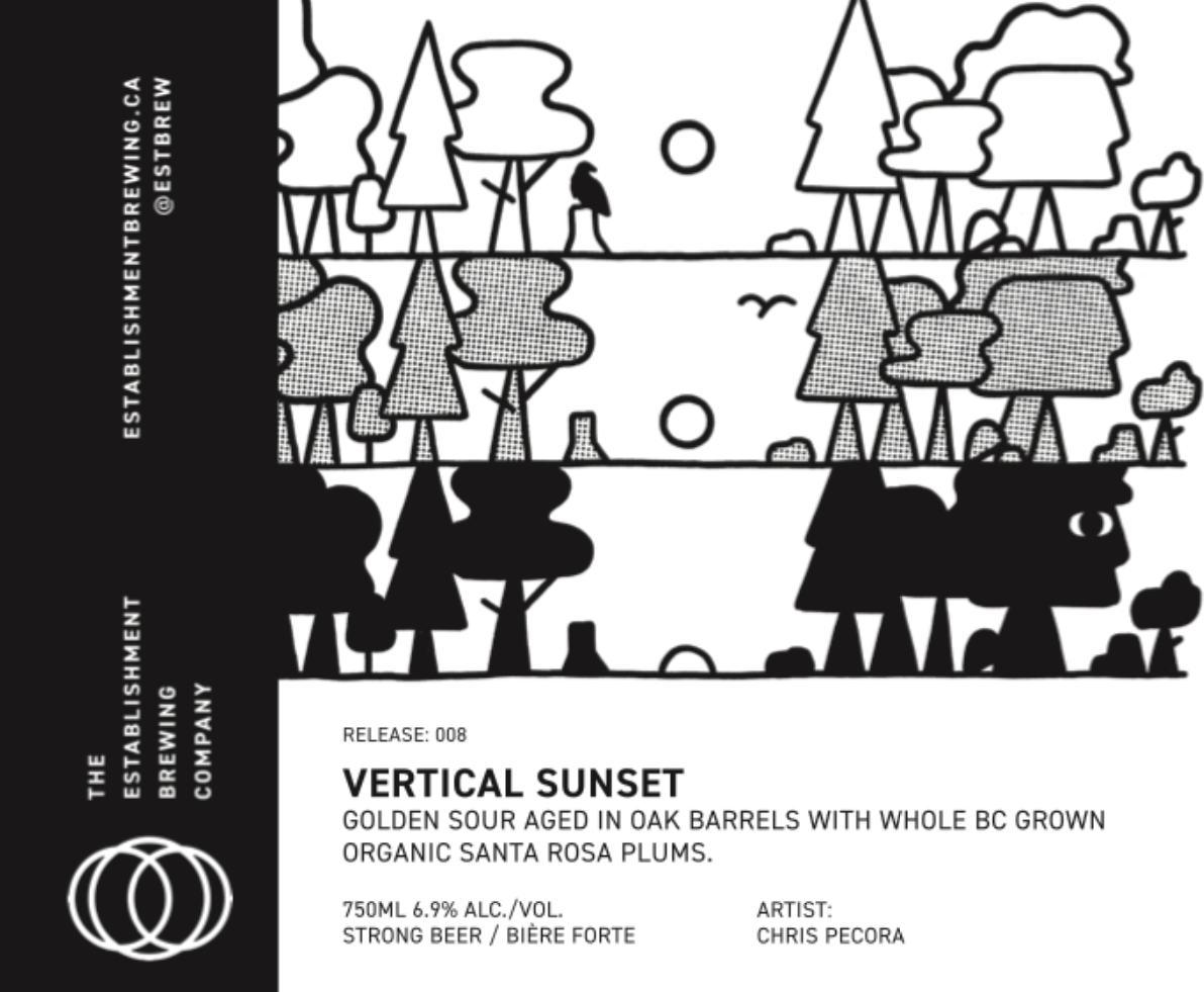
Chris Pecora
Chris Pecora is a left-handed graphic design & illustration hybrid making stuff from Calgary. He aims to bring ideas to life using bold shapes, bright colours, and hand-made elements.
“The illustrations I created are imagined through the lens of “The Establishment” as an ominous and influential power within society. Using the name of each beer as a prompt, I explored the methods and processes of such a force – resulting in themes of mind-control, distortion, and what happens after the sun goes down.”


We teamed up with our next-door neighbours at Annex Ale Project to commission Chris Pecore to create this fun 1st Street SE Beer Map.

Kate Schutz
Kate Schutz lives and works in Calgary, Alberta, where she paints memories: her own and others around her. Her work is in private and public collections across North America, including the Alberta Foundation for the Arts and, oddly, Universal Studios.
Kate's label designs for the Establishment's release of Brett Saison four ways were inspired by Chinese scroll paintings and the old AMA road map in the back of the car. While the hibiscus flowers are a nod to a traditional, classic time where artists studied exotic blooms, the aerial view of the Manchester Brewing District (home to The Establishment) is sourced from Google Maps.


Photo by Peter Kaczan (@carefree.photo)
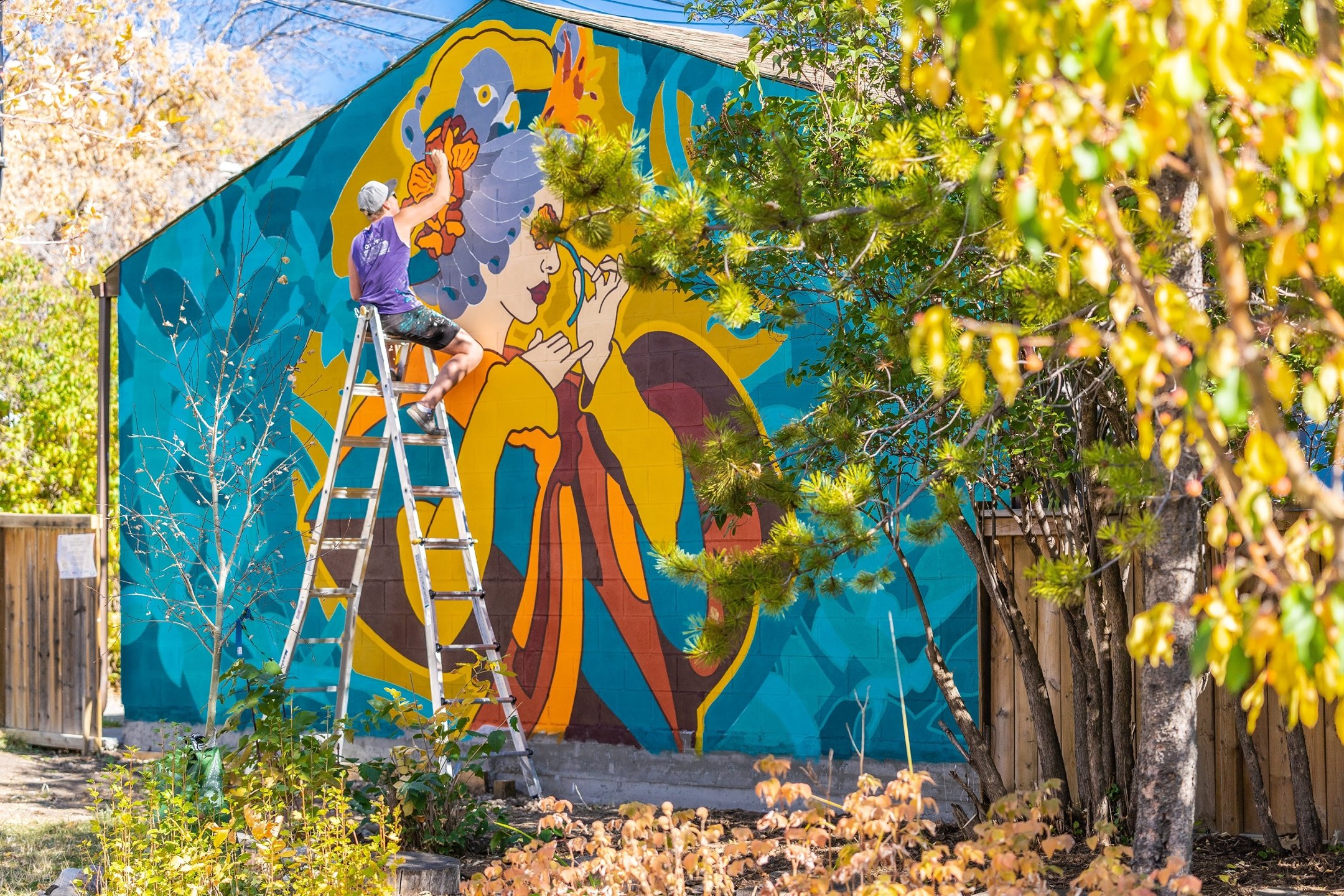
Toner
In 2020, we worked with Toner to bring our patio expansion to life with this mural.
Toner is a Calgary-based graffiti artist and large-scale muralist with over a decade of experience working in public and private realms. His visual language spans from clean and vibrant typographic and abstract designs to highly detailed photorealistic representations of plants and animals.
With an artistic background in urban art and a professional background in architecture, Toner’s skill set allows him to marry a unique creative approach with detailed planning and execution on any project. He has also collaborated with another Calgary-based artist, Alex Kwong, which can be found around the city.